The 2013 Thought Bubble comic convention is now far behind me, as is my first experience from the other side of the table. I had a fantastic time, so much so I found myself feeling waves of sadness and loss both when leaving the New Dock Hall on Sunday evening, and on leaving Leeds the following morning.
Despite attending the convention in previous years, I didn’t have much of an idea of what to expect as an exhibitor. I suppose I had an inkling from the experiences of the friends I’ve met up there, but it was still a blank sheet in terms of interest in my work. All I could really hope for is for people to take a look.
The view from behind the table before opening on Saturday.
I brought a humble bundle consisting of my first two mini-comics, Done and Control, and a fine selection of badges to sell; as well as art cards and sweets to give away.
Lem
I had the pleasure of sharing my table with Lem, a Leeds resident and Thought Bubble veteran, who had given me some useful preparation tips prior to the weekend which made setting up on Saturday morning a breeze. Lem was great company, helping pass away time during quiet spots and also fulfilling cover duties during the all-important comfort breaks.
Lem’s newest comic Botany is a delight—a 28-page microcosmic tale set deep in the cosmos, involving two humans, some alien dirt and a rather enthusiastic peace lily. The quip-filled script zips along supported by what I reckon is Lem’s best art, an assured display of emotion and action in stark black and white. Botany is available from Lem’s store.
Lem also brought with him his Melon of Chance. The Melon is an enticing combination of village fete and sales tool where people can pay a pound to pull a pin which picks a prize. Every player wins, and rare pins can win high value prizes. It’s a very effective talking point and a great way to engage with passers by, and with most of Lem’s stock cleared on the Saturday I had the honour of taking care of the mystic gourd for the Sunday. It was no coincidence Sunday was my more active day.
The weekend
With three halls and a stunning list of guest creators signing over the weekend, it’s a tough environment for attracting attention, especially as a first-time exhibitor and ‘nobody’ in comic convention terms. My two mini-comics, badges and give-aways made for an unfussy display. I was worried it would look anaemic, especially when tables all around me had an abundance of amazing things to see. Thankfully, both myself and my table partner Lem were kept busy throughout the weekend with curious folk of all ages.
When the doors opened on Saturday morning there was an orderly and very British dash through the entrance, past most of the tables to the rear of the hall, where many of the queue-drawing guests were based. It was exciting to see the day start with a bang like that, even if it took a while to see people filter by the table. From around 1130 to 1400, New Dock Hall was heaving with people; as many as I have ever seen. Both Lem and I were solidly on our feet for a lot of that time. Come the afternoon, I took my seat when I could and sketched the to-be-named robot character in various predicaments, primarily for my own entertainment but the sketches also made for fun bonus freebies.
Yours truly sketching at Thought Bubble 2013 alongside a finely dressed Lem.
Saturday night fever
My MOMBcast travel partners, life partner Jane and good friend Nick, have been great company on our trips to Thought Bubble. Unfortunately something was off this year and both of them struggled with flu for the entire weekend. They gamely did their best to make the most of their time in Leeds (not to mention the money invested in the trip) by dosing themselves on a variety bucket of lozenges from Boots, but it took its toll.
Saturday night is usually a big social affair, with a restaurant trip before the official mid-convention party. This year, Nick fancied giving it a go and subsequently lost his voice. Jane retired to the hotel on Saturday to rest and recuperate for the evening, and I couldn’t in any good conscience leave her.
The upside was being able to watch the Doctor Who 50th Anniversary special, and make our first ever room service order—a total indulgence but totally justified given the situation. Not so unusually for us, we ordered more food than our stomachs could realistically handle. Doctor Who wasn’t too bad either.
Sunday
Sunday was a quieter day, both in terms of weekenders gently recovering from the night before, and in general footfall. I’d met several people who had swung by on the Sunday on recommendation of friends who had visited on Saturday.
The Melon of Chance kept me on my feet for a good portion of the day, and I was really pleased with the opportunity it gave me to put my work in the hands of more people. In the quieter moments I sketched a few more giveaways.
As those with more experience than me will testify to, the one big difference as an exhibitor is how difficult it can be to break away from the table in order to see the rest of the convention. After stopping off at a few tables in New Dock Hall, I managed to shoot over to Royal Armouries Hall for about twenty minutes but ran out of time to do the Allied London Hall at all.
Speaking of Warwick Johnson-Cadwell and Robert Ball, collectively known as Cadballs—their awesome online project Dangeritis made it to print, care of Great Beast. It’s a high-energy mash-up of complementary but distinctive styles, introducing the legend of Derek Danger. As a bonus, part of both the front and back matter features the guest art they’ve received since the start of the project back at the start of 2013, which I’m excited to say also includes my submission.
Thanks Cadballs. Thadballs.
Name Me, Win Me
As mentioned in a previous post, I ran a competition throughout the weekend to officially name the character originally known as Cute Bot. The winning name would earn the competition winner an exclusive A4 print posted straight to their door, and eternal bragging rights of course.
The winning name was decided the week after the convention, and the winner has already received their prize. The official announcement has yet to be made, but is coming very soon.
The end?
When the convention drew to a close and the attendees were whisked away, I was still buzzing from the exciting weekend. I expected to get to the end of Sunday and feeling pretty wiped, but I was still brimming with energy. Amongst the many sellers and exhibitors, I too had a series of little successes in being able to capture people’s attention and make a few sales.
It was a shame to see both travel partners suffer, however. Not only did it have a big impact on their ability to enjoy their weekend as much as possible, but really wanted to share the fun I was having with them.
I hope to return to a table at Thought Bubble 2014, and this time with everybody in rude health.
Until then you can purchase my comics and badges from my store.
The Thought Bubble comic convention hits Leeds once more, and it’s this weekend, the 23rd and 24th of November. It rounds off a week-long comic arts festival featuring workshops, live events, signings and screenings; all centred around the world of sequential art. The convention draws an incredible range of independent talent and the cream of big name artists and writers.
I’ve been attending since 2010. That first year it was a one-day only convention, spread over two halls, and there wasn’t quite enough time to check everything out. Since then it’s been spread over a whole weekend, and has got busier and more awesome each time around. Contrasted with the chilly autumn Yorkshire air, the atmosphere inside the exhibition halls has always been genuinely warm and welcoming, with a real end-of-term feel to proceedings. Whilst I haven’t attended a great deal of conventions in the UK, Thought Bubble is the one I love, and hope to go to for years to come. This year in particular is set to be a blockbuster event, with a third hall for the very first time, and a frankly mind-blowing list of guests.
This will be my fourth year there, but my first as an exhibitor instead of a visitor. It will also be the first time I have exhibited any of my work anywhere so, for me at least, it’s a pretty big deal.
I will be bringing a humble little bundle of items for you to peruse (and buy!)…
Goodies
Mini-comics
There are two 12-page, black and white comics, both of which are of a personal and somewhat autobiographical bent. The first is “Done”, a comic about beating the little voices; the other is “Control”, a comic about our place in the universe.
Badges
Everyone loves badges! If you like robots, sweet treats, or woeful visual puns you’ll want to pick up these little beauties.
Win a prize!
As seen elsewhere on my site, I’ve had a little robot character kicking around since 2009. So far he’s had the working name of Cute Bot which is fine for my purposes but I don’t feel like he’s going to really come alive and find his own stories until I know what his real name is.
This is where you come in. I’ll be running a free competition throughout the Thought Bubble weekend where you can put forward your suggestions for Cute Bot’s real name. You can submit as many suggestions as you like (as long as they’re not rude or already existing character names), and should I pick your winning suggestion I will send you an exclusive A4 print to wherever you are in the world.
Where to find me
If you’re coming along to the Thought Bubble comic convention at Clarence Dock, Leeds, you will me find me at table 68 in New Dock Hall. I will be there both Saturday and Sunday with my table buddy and creator of Bunny Comic, Lem, who will be bringing an all-new comic along with the famed Melon of Chance, and other goodies.
I’m looking forward to really fun weekend, and hope to see some of you there!
Back in 2009, my friend Nick introduced me to the Travelling Moleskine project, a creation of the people at The Culture Vulture. The concept was pretty simple: Moleskine sketchbooks get released into the wild, each with their own theme, and the book gets passed around from person to person who takes up a page or a spread to creatively interpret that theme.
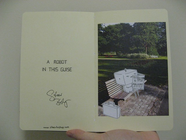
The book which came into my possession was “Robots in Disguise”. In my own sketchbook I worked on a design for a robot who would be conducting a little espionage in the park. Some of the early concepts as I was finding my feet were frankly embarrassing, but everything paves the way for something and I eventually solidified two designs. One was a clumsy, oafish looking robot dubbed Turtle Bot, and the other was a small creature with a giant head given the (still) temporary name Cute Bot. I couldn’t decide which to use so I asked my Twitter followers for help and Cute Bot won out.
The finished piece involved a printed photograph and cutouts of pencil drawings of Cute Bot and his briefcase. These were carefully stuck to the page, followed by a little more pencil work to create shadows behind the robot and briefcase. In my haste I didn’t wait until daylight to take a photograph of my work, so the only copy of the final submission rests in a grainy photo taken in my kitchen. The book soon left my hands and moved along the chain.
Frustrated that I didn’t have a better copy, I decided this July that I would digitally recreate the piece. The photograph was simple enough to dig out of iPhoto, but for the illustration I referred to extra sheets of the original drawing I’d created just in case I screwed up with the scalpel. After scanning, I retraced the illustration in Photoshop with a custom brush, and then masked the layer with a textured brush to simulate the cutout. By subtly dropping the opacity of this layer, I could further capture the feel of paper on paper. After adding shadows behind the robot and briefcase, and creating a paper background similar to the Moleskine, the work was done. Now I have a cleaner, sharper copy of the original that hopefully still lives out there. Somewhere.
In retrospect I’m glad Cute Bot made it. I think it’s an adorable, expressive character with the potential for lots more exploration. The fact it’s fun and rewarding to draw helps, as he makes occasional appearances in my sketchbook. I hope it won’t be the last we see of it.
Following along live to an Apple keynote has been a ritual of mine since somewhen in the noughties. It has been a little messy at times, monitoring various liveblogs over several browser tabs whilst watching video from TWiT as they try to hunt out a sneaky stream from a laptop in the conference hall. Thankfully Apple have returned to streaming live video allowing me to focus on their announcements, and giving me the benefit of having an honest, personal reaction uncoloured by several browser tabs covered in adulation, sarcasm or indifference.
“Can’t innovate anymore, my ass”
The opening keynote at Apple’s 2013 Worldwide Developers Conference was their first since October 2012; a near seven month gap from a company usually making some sort of public presentation every quarter. Coupled with the unusually long period of silence was a successful “doubling-down” on secrecy. Rumour trickled in the final few days, a stark contrast to the flow of spoilers preceding keynotes past.
The pace of the keynote was breathtaking. It was a dense two hours and memorable for several key changes—the new OS X name, the Mac Pro and iOS 7. What struck me most at the time was how assured the entire presentation was.
Unapologetic for their long run of silence, here was Apple in full stride, chest out, ready to open their box of surprises. Tim Cook has developed a more comfortable presence. Phil Schiller too appeared looser than he has ever been, and as a marketing guy he’s no stranger to addressing the public. The clear highlight was Craig Federighi. He was energetic, witty and sharp as a tack. Craig not only owned the stage for the considerable amount of time he was up there, but he didn’t miss a beat when responding to audience reactions. The keynote seemed no less rehearsed than before but it also felt less stiff and more human.
The Mac
It’s been an Apple community in-joke for years, and now Apple too has recognised they’re all out of cats and have introduced a new naming convention for future OS X releases based around inspiring Californian landmarks. It might as well be personal to Apple. It’ll feel good within the company and help define Apple to the rest of us.
Image from @Kookizu
OS X Mavericks is a steady, incremental update to a stable and mature OS. Mac, iOS and iCloud integration continues with Maps and iBooks; there are welcome updates to the usability of notifications and managing multiple displays; and file tagging and Finder tabs look to make navigating either dense or untidy file structures simpler. I was more taken with some of the technical features, however—especially App Nap and Compressed Memory which should help improve performance through desktop and portable Macs. It’s good to know an OS can do more than just shrug its shoulders and cite Moore’s Law.
The MacBook Air got a handsome improvement to battery life which, when coupled with OS X Mavericks, should make it a reliable all-day portable computer. That’s no mean feat.
Over a decade after the giant aluminium wind tunnel was launched, the Mac Pro received a significant and long-awaited update. I guess there was little point redesigning the hardware until Apple were happy with a predictable direction for I/O. FireWire is out USB 3 is in and Thunderbolt 2 should hopefully be the super-fast, catch-all solution its first iteration couldn’t quite deliver. That looks to be a solid base for the next five years. The product design was compact, bold and thoughtful in terms of accessibility and cooling. Apple’s message is clear: a solid-state core is going to drive the OS, apps and key files, and any extensibility is the user’s business. Business should be ripe for cable-management solutions for years to come.
iOS 7
Mobile remains a lightning-fast area of innovation and development, and while other platforms are iterating apace many tech pundits have felt it has made iOS appear as a sedate behemoth in comparison. Many niggling details with features and usability were ironed out by the time iOS 6 came along. The iPhone 5 shortly followed. Both seemed to underwhelm analysts and tech press who were looking to Apple to stretch a little further beyond the competition. Were they so hungry for something radically new that a steady pace of evolution was no longer sensible? Were they bored?
This versus that
Adding to the restlessness was a growing debate about aesthetics in the mobile space. Was there any place for tangibility and texture in an area so innovative it was making its own rules? Perhaps Apple wasn’t helping with apps such as Game Center, Find My Friends and Podcasts. They weren’t subtle. They tried a little too hard to emulate the physical world to establish context, laying textures and objects on thicker than before.
I didn’t mind Game Center quite so much. In what is essentially an app full of achievement lists and high score tables, why not get a little cute and throw in a skin of wood and green felt? OK, so an eight-year-old kid with an iPod touch won’t be familiar with the Blackjack table but they’ll kind of just get it anyway, right?
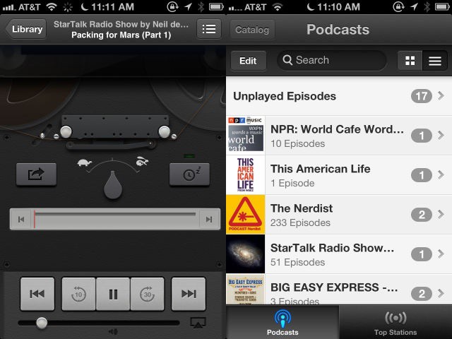
The Podcast app was the tipping point, I think. A real case of wrong interface, wrong time. Apple knew it too, and didn’t waste time in updating the app to cull the worst visual excesses. You may think that was the reel-to-reel tape, but I couldn’t stand the horizontally brutalised Helvetica.
By contrast, Android and Windows 8 were far less interested in emulating the real world, eschewing texture and instead focusing on simpler and cleaner ways of serving up the user’s data. It made many designers feel like Apple were pushing too far in the wrong direction. Digital corinthian leather became the poster child for the skeuomorphic trend, and virtually monochromatic and buttonless (and possibly just a little dry) environments became known as flat.
I gave the debate a wide berth. It got noisy pretty quick, was too simplistic and focused on what the prevalent trend was so much so that it made skeuomorphism was the villain at all costs. The debate wasn’t doing such a good job of considering what was contextually appropriate, nor did it much entertain the value of real-world visual cues…is my simplistic summary.
Birth of iPhone
At the very beginning of iPhone, at the January 2007 MacWorld Expo, was a brand new OS. Through its icons and interfaces, it carried a familiarity with OS X whilst they were discovering a touch-focused UI. Visually rich with a glossy touch reminiscent of Aqua, all brought together with a consistency of lighting and depth. Apple boasted iPhone OS was five years ahead of the competition at the time. Six years on and iOS is in a lot of hands, and the language it introduced has made it to in the competition. There’s a convincing argument that people get the concept of a touch interface now, even those who have only seen it in action without using it or owning a device running it.
Whilst early third-party apps were aping Apple’s own, today’s designers and developers are extremely confident creating their own experiences. Some, such as Clear don’t have any recognisable buttons and invite the user to learn the app’s individual language. This isn’t a case of repositioning a back button, it’s more about inventing gestures and discovering new ways of displaying information that better fit within each app’s ethos. That would have looked crazy back in 2008 at the App Store’s launch, but now it looks more crazy to people that iOS 6—a mature and steadily evolving OS—hasn’t caught up to the rest of the market.
Surprise
iOS 7 was introduced with a video. Here was the confirmation things were different. As with any design presentation, it’s important to set the stall for why decisions were made before you show the results. The consideration given to interactions and access to controls was sensible. The formalising of z-axis depth was a good step too, giving reason to why sheets and objects appear to be either in front of or behind others. This was all logical.
It’s surprising how much of the core design remains with iOS 7— which is a mark of how assured many of their initial decisions were. The visual approach got a huge overhaul to boost simplicity and ease of use, and take out anything that contributes to clutter. These changes were frankly disquieting.
During the time spent working on this post, I’ve got comfortable with why that is. I think it comes down to three things: shock, taste and tenure. It was a striking new direction so different from a style I had become very comfortable and embedded with over the last ten years in both Mac OS and iOS.
The general interface uses a lot more white space to define regions of content and context. Shadows are scaled right back, keylines are slender and buttons are almost entirely free of chrome. App tab buttons forego borders and bevels, and many of the navigation and input controls have larger text. You can see why: a whole bunch of obviously pressable buttons sitting in thick beveled bars at the top and bottom of an app narrows down key content in the centre of the screen. Colour is generally used to mark out which text controls can be pressed, or whether they are active or not. This could cause some initial confusion on what is and isn’t interactive, but shouldn’t present much of a learning curve.
Notification Center has text-only tab buttons contained within a slim border. I still find myself swaying to that approach but the downside to this, and probably the reason it was ruled out as an option everywhere, is that it would have required a reduction in text size and defeated efforts made to clean up controls.
I’m troubled by areas of low contrast, mainly those caused by the frosted glass effect blurring the items beneath it. The most obvious use is in Control Center, which thankfully unites many regularly accessed features once hidden in the old iOS’ multitasking interface and Settings app. There is a load of utility here but it’s harmed by blurring the plane behind it, merging colours to form a sludge of clown vomit from which thin black and white lines are expected to stand out. Against a photograph or an app largely free of complexity, this might not be so much of an issue, but against a home screen with a hotchpotch of icons atop a photograph and we’ve got a bit of a mess to deal with. Given a little time, muscle memory will probably do more of the navigating in Control Center than the eyes, but it is an aspect to the design that I find visually unappealing. It is the one area I would expect users with colour blindness or sight difficulties could struggle learning the interface, where background tones could get too close to the black and white used of the interface. Turning down the saturation could be a step in the right direction, or reducing the opacity of the ‘glass’.
There will no doubt be further iterations of iOS 7 before the launch later this year which could well iron out concerns many are having, but the broad strokes here mark the new framework and direction that’ll lead the next five or six years.
Boy, how about those icons though? In the opening video, Jony Ive talked about developing a grid system and a colour palette for Apple’s iOS icons. On first glance it appears to be a fussy move. We’ve had successful, beautiful app icons for years without it, so why would this be necessary?
Back in 2007 Apple’s apps were the only game in town. Their icons had to represent each app’s functionality, but didn’t need to worry about a universal language because they weren’t sharing a home screen with anything else. There is a vast market for apps today, and for a while Apple didn’t seem to mind being lost in the shuffle but iCloud changes the game. Apple wants you to use their pre-installed apps to host and sync your contacts, calendars, notes and the like, and now a universal language makes sense.
By using the tried and tested grid system, ubiquitous in print and ever evolving on the web, Apple can create a range of icons that say a lot of different things but are nevertheless subtly (or not so subtly) linked to each other. They also introduced a palette of astonishingly bright colours. I initially referred to icons as garish, and I think it was the use of colour that gave me that impression. In moving away from real-world paradigms there is no advantage or disadvantage in continuing to use real-world tones. The screen is the medium and the screen takes the lead.
Some colour choices are seemingly arbitrary, however, such as the black in the Stocks and Compass apps. By being predominantly black I feel like I’m being told these two apps share a utility or purpose, but a compass and stock tracker are as about as related as an elk and a chair. Instead, these icons are black because the appearance of the apps themselves are predominantly black. This isn’t consistent with other app icons which appear to be colour coded by utility as with Messages and Phone. Both of those app icons are green now as they have always been.
A new joy?
The last six years of iOS and the last thirteen of Mac OS X have given us millions of first- and third-party icons with cute references to how things look in the real world. It was in keeping with Apple’s vision of a human interface. It carried with it a touch of humour and a spark of recognition which made us comfortable in this digital space and told us it’s not as different or as alienating as we thought. It’s part of the joy Apple has always sought to give through their products.
My gut reaction on first viewing this new range of Apple icons was honest, utter shock. They all looked a little too dry, too stark for the Apple I’ve known. Where was the fun? Pundits, analysts, investors and designers had been clambering for a new look, perhaps with an expectation that it would essentially look very similar but have a more matte finish. Tasteful, flat, but still the Apple they knew. There was no iteration this time, no slow flattening of images once packed with texture and depth. This is a new visual direction looking to better fit a range of Apple hardware that has already removed extraneous detail.
But could this new Apple look at cute touches from the past, such as the genie effect when minimising windows to the dock in OS X, and decide it is unnecessary? Will it take itself too seriously in an effort to separate itself from a visual legacy left behind by Jobs and Forstall?
In closing
At the start of 2007 there was a feeling we could carry more than just an iPod in our pockets. When the iPhone was announced, as surprised as we were by how Apple had approached it, we were ready for their solution. Six years on and we were ready for a more than just another incremental iOS update, and got a solution we weren’t ready for. Apple did what they do best, looking at where the puck is heading.
Somehow we were caught off guard. I know I certainly was. Whilst things can certainly change between now and the public release of iOS 7, the shock will wear off pretty quickly and it won’t be long before we wondered why we ever jerked our knees quite so hard.
A friend of mine and I had often joked about inspirational quotes and life coaching popping up on social networks; at the idea that it’s a magic bullet in and of itself. We’d tweet brief exchanges in the Drunk Hulk mould of caps lock, exuberance and typos, having a good chuckle about it each time we had an episode of what we termed LIFE COUCHING.
Back in January this year, it occurred to my good friend there was some mileage in developing this character as a parody Twitter account and thus @LIFEEXSPURT was born. Recently named as Davey Mellencamp, our “exspurt life couch” has made topical observations, offered crucial life coaching tips, and has promoted his range of services.
Although we hadn’t discussed it in much length, I offered to make an avatar and graphics pack for the parody account. I wasn’t sure how to approach the profile banner and background for the Twitter page, but I had an inkling of the avatar in my mind’s eye.
Facing the avatar
Davey follows a few choice Twitter accounts which, along with his wisdom, gave me the shape of his character and the people he finds interesting. I felt that a range of successful and famous people of the sort Davey would admire would provide a bed of references for how Davey himself would look.
I wasn’t initially sure how I would build the face—whether I would take the nose from one person and the eyes from another, for example—but I wondered what sort of result I could get from layering all the faces on top of each other. Could I make a whole new face from combining all these other faces?
I needed clean and ideally full-face head shots, and I wanted the photos to have a licence for remixing where possible. Wikipedia was my natural first port of call and thankfully I was quite lucky with what I found, both in terms of usability and Creative Commons licensing.
Rogues gallery: (top row, from left) Alec Baldwin, Ben Stiller, Billy Crystal, Ethan Suplee, George Clooney, Jay Leno, John Travolta, Matt Damon; (bottom row, from left) Paul McKenna, Ricky Gervais, Seth MacFarlane, Stephen Fry, Steve Ballmer, Steve Jobs, Tom Cruise, Tom Hanks
Many of the images were of suitable resolution and quality, to the point where the images of people I’d like to include which weren’t so suitable could still be used to add texture, and have an influence on the final result.
Making a face
I started with a 1024 by 1024 pixel canvas in Photoshop and imported each image, making sure they were all Smart Objects. Whilst Smart Objects ramp up the document’s file size you benefit from non-destructive scaling, referring back to the original image data if there’s a need to do more than one transform.
I marked out an oval shape layer in the document for the approximate size of the face I was looking for, and then positioned each layer so the faces fit within the oval. I dropped the opacity of each layer to around 8% and added a multiply layer blend in order to see all the faces merge together without the mid tones and shadows dominating the composition. From there I could mark out with guides where the eyes and mouth would land, and then drew a very rough outline of the main features of this new face. I would use this sketch to help align facial features to help bring the face to life, starting with the eyes.
Davey develops: aligning the faces at the eyes and drawing the outline
Here’s the result after the eyes are aligned. It’s remarkable how a new face is already forming after only aligning one element. At this early stage the image is full of peripheral information and yet the brain can still make something new from it. I was energised by this, and it became clearer how I would continue. I drew another slightly more detailed outline of the face, picking out and deciding on the features. This would help me align the nose and mouth.
So now there’s a base layer group for the eyes and face as a whole, and layer groups for the nose and mouth respectively. From here, I copied and flattened those layer groups so I could do some fine tuning, largely involving tone blending and masking. The one thing interfering with the quality of the face at larger sizes were spectacle frames from a few of the source images. Using a combination of the clone tool and spot healing tool, I painted out signs of the frame from around the eyes, brow and nose. The details around the hairline and ears were left in as they didn’t break the spell enough and contributed to the textures outside of the face.
With the facial features done, I was impressed how effective the image was, particularly at the smaller sizes. A real but made-up face with a ghostly periphery. One thing wasn’t sitting right though: I needed to align the ears and include those too. By masking those into the final image the eyes were framed better and there was a stronger line around the jaw.
It’s a fascinating technique to work with and I’m very tempted to try it out again with a different set of photographs to see what comes together.
Prologue: Tongue in cheek
The humour behind the avatar is several layers deep (literally!) and not obvious without explaining, but I wanted the result to be straight and look genuine. It was another matter when developing the rest of the graphics for Davey’s Twitter profile.
The aim with the profile banner and background was to overload on the earnestness but to have a rough and home-baked look. As such, it would be more believable if the result wasn’t that of a professional. Going against my instincts of fit and finish was a touch uncomfortable but dammit I was going to have fun with it.
Davey’s profile banner is a representation of his ego, his third eye and his particular brand of blue sky thinking. The background follows a lead taken by companies, brands and social media experts by using it as another method of communicating as opposed to a pleasing image or texture. Davey’s approach is communicated through a selection of keywords such as dream, inspire and motivate, and he’s also made the wise choice of picking one of the friendliest typefaces available in Comic Sans.
Note: Tim Robbins was also part of the reference haul and whilst his face was used to help form the nose and mouth, he didn’t form the initial build of the eyes and face.
The sketches came thick and fast, building and rounding out Derek. The Britishness oozed through, and I was nuts for it. Well, that’s an exaggeration. If “went nuts” was 100%, I was around 80%. 100% would be a bit irresponsible. I wouldn’t be able to afford the repairs.
The first few pages are up on the Dangeritis Tumblr as of this post. Some villainous looking sorts have just turned up, and at any moment there’ll be enough pages for me to tell you what it’s all actually about, but I’m excited to see the world unfurl. I’m already pretty big on Warwick’s work, and Robert is now on my horizon following last year’s trip to Thought Bubble in Leeds. Both have distinct, quite separate styles so watching them smash together to tell stories is going to be a lot of fun.
Taking on Derek
I wanted to have a go at Derek so I busted out the sketchbook.
This was the first time I’d sketched using blue and red coloured lead. I started with the blue to really rough out the general shapes, and turned to the red to put down some more definitive marks to help guide the final inking. There are two advantages to this. The first, by getting away from using just the one, greyish pencil, is it’s easier to be rough at first and build on the early lines without it all becoming a mash of one colour. I can make as much mess as I like with the blue, knowing I’ll clarify my intentions with the red. The second advantage comes when the inked art is scanned, as the blue and red can be filtered out, leaving just clear inks.
With experience, you’d pick just blue or red, sketch everything out and go straight to inking. My linework is still pretty tight and cautious so using both helped me relax.
Derek Danger, from the sketchbook
It took approximately the length of one episode of Six Feet Under to get the pencils together. I was hesitant about directly inking the piece in my sketchbook so I followed some advice from the excellent David Wynne, and scanned in the pencils so I could print copies and experiment. I printed two-up on a sheet of 135gsm A4 and tried both my Pentel brush pen and fineliners out for size.
Inked: brush pen on the left, fineliners on the right
I was really happy with the results from the brush pen and the control I had over the line weight; it allowed for some more organic marks on the cigarette ash, and I liked the way it took on the paper’s texture. The only spot I didn’t use the brush pen was the target on Derek’s shades.




 By using the tried and tested



.jpg)


.jpg)


